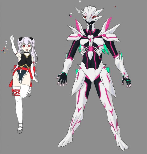
As I promised, posting old-ish art.
So, I play a lot of tabletop games, though online so there's no table involved. One of them is CthulhuTech. Which has a funny system some people have problems with but it's overall a pretty good game. It's pretty much what happens when you take giant mecha, the guyver, and the Cthulhu mythos, mix them all up with a bit of scifi anime flavor, and don't get Demonbane as a result.
This is my character for a game using this system, in which we do things that the developers never intended, and make a bunch of Japanese schoolgirls into eldritch-horror henshin heroes (called tagers). Her name is Saya, and she's a near-complete idiot. She watches too much magical girl anime and idolizes the characters in it, and has concocted a delusion that now she is one. Even if her post-transformation form is some sort of seven foot tall inhuman monster. She makes up for it via cosplay when in human form. that outfit she's wearing is one she made herself.
Saya kinda lost the genetic lottery, in that she's got no pigmentation and is sickly to the point she'd be dead if not for fancy future-medicine and socialized health care. Her tager form is supposed to be an efreet, which is a humanoid mass of magma, rock, and fire. Obviously, this is a personal and very much altered design for one. ...I mean, pink lava? I couldn't render decent-looking pink flame, or there'd be that, too.
The game in which I'm playing her is almost over, and Saya's managed to remain shockingly sane. Oh, sure, she's a little worse for wear, but her friend's done a LOT worse. And this is despite violence, tentacle monsters, more violence, death, friendly Deep Ones, and so-on.


